When it comes to train travel, there is one major player in Poland - the company called PKP Intercity which is also a national carrier. Unfortunately, I don't know anyone who see no flaws in PKP Intercity website and use it effortlessly. But I know a lot of people in all ages who'd rather go to the station and buy a ticket face-to-face only to avoid using this site. As it is carrier supported by the government, it should be user friendly, so... what exactly goes wrong? This is always a tough question.
Let's have a quick look at some shots from current IC page:

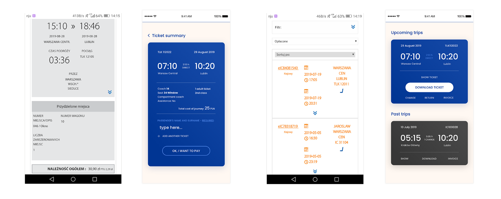
That's a quick summary of steps in Intercity - you can see small CTA's and some things that seems to have no logic like that blank areas in the top sections. Especially on a page with search results - you need to scroll a lot
A large group of designers used to complain about Intercity website, but there is only few redesigns available on dribbble/behance/agencies websites and they are presented in a scarce way. I have also complained many times and did nothing afterwards, but now for the first time I decided not to be unfounded and create something more valuable for others. Not only it was revamping the visual style, but also an attempt to create better experience for the users.
That project was made mainly in my spare time. As my budget was not unlimited, I tried to use only free research and prototyping methods. All together, it took me over 2 months to complete the project (over 1,5 month for interviews and defining the concept and next 1 month for design, meetings with frontend developer, project interactions, etc.).
Process:
My process had started from benchmarking and looking for any suggestions that could help me focus on main pain points. Poring over through official Intercity Facebook page was also very helpful and I treated it as an additional persona during my research.

I also did a quick audit of existing page. The cognitive walkthrough has shown that average amount of steps needed to purchase the ticket could go up to even 9 steps, including different kind of bugs or pop-ups that may appear on separate screens (during the interviews one of my participants had 12 steps to go through!).
Although I had dozens of ideas on how to improve the website by myself, my intention was to cover not only my needs and to create a project that would be valuable not only for designers. Hence, I decided to make some in-depth interviews. I wanted to make 10, but I didn't expect it to be so time-consuming to find participants, make interviews, go through scenarios, test the prototype, then create transcripts, analyze, create a persona and user journey maps... So after reading this and this article from Nielsen Norman Group I decided to cut the amount of participants to just 5 people.
Each participant received the same questions and were asked to do a task according to scenario.

Transcripts from my interviewes.
Simultaneously, after two first interviews, I made a paper prototype, which was low-cost and made me more flexible in defining the overall shape of the product.

Some quick sketches
At that point I had a vision of what users might want, but all my thesis were verified by the following participants. After paper prototyping I made very simple, interactive version using Adobe XD which was tested by three users just after completing a task on real Intercity page.
That's my wireframe tested by the user. I recorded it using Adobe XD
The first moment where interviews were very helpful was when it turned out that my participants are not interested in desktop version at all. They use it just because the mobile version/Intercity app does not work properly. Being asked about their daily routine and preferences, all the participants in the age from 20 to 35 definitely stick to mobile, as they usually use it in a rush. Hence, I decided to focus just on mobile version. As I was working alone, it seemed to be a reasonable decision, otherwise I could not handle it all by myself.
Having gathered all the user insights, I started to analyze the data. There were dozens of user expectations I could not deal with, e.g. things connected to backend stuff, which users insisted on me to change even though it was clearly communicated that my project would not be that complex.
In general, all the users were focused just on the tickets section. They didn't see a point in looking for other things such as delays, customer service desk, facilities, as the language on the website was misunderstandable. Huge, centrally located banners were completely ignored and perceived as nothing more than a waste of time, because of irrelevant copy with typos. One respondent (while using desktop version of ICC) was even covering the banner section by hand, because - as he said - he feels so distracted.
It was obvious that my users didn't need a website in a shape presented by Intercity, therefore I decided to cut out all unnecessary sections and focus just on the process of buying tickets and user account panel.
Not to make it too long, my survey has shown that users need:
- simplicity
- larger CTA
- important things not covered by banners
- ability to buy return tickets in the beginning of the process
- suggestions while choosing the name of destination station
Users definitely do not need:
- chaotic, flamboyant banners
- unclear language
- being overloaded by the amount of useless information
- being directed to new tabs after every step
- ads
Having collected all the insights, I could focus on turning them into practice.
When first mobile version was ready, my next step was to ask a frontend developer to confront my vision. It was not a piece of cake, but eventually his honest opinion allowed me to find a balance between visual stuff and technical constraints. The first session ended up with a certain amount of issues for me to change or reconsider the conception, whereas the second was rather presenting the results and reassuring that I am on the right track. During both of them the prototype was tested by the developer. After two heated debates we reached an agreement and I received a bunch of pro tips for the future. But it was not the end - when my app was finished, I showed him my results again and we made another iteration.
When it comes to design, things are so much easier to do when you can base your decisions on research. I decided to use lighter palette of colors than those presented in official Intercity CI, but I tried to keep a high contrast ratio between crucial elements. I didn't change colours completely, because my research has shown that they are perceived as relevant to the transport industry. My intention was to stress the importance of clear composition and understandable language, especially on CTA.
Due to the exclusion of desktop version, I also wanted to think about dark mode and contrast mode in my project. Dark mode was something I always wanted to do, but had no occasion to try.
I especially focused on contrast mode, because a person with impaired vision might not find current Intercity page helpful (small dark grey or dark blue icons on black background, dark gradients in dropdown sections making white text less visible, etc.).

This is how Intercity desktop page looks like in a contrast mode.
The results of my work are presented below:
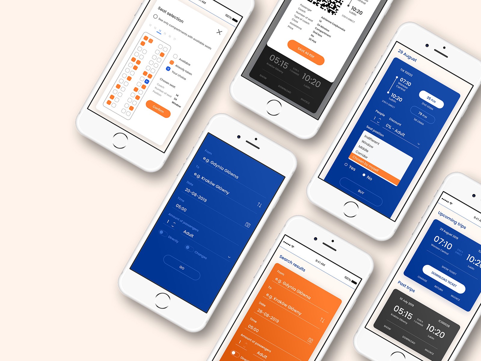
Dark mode:
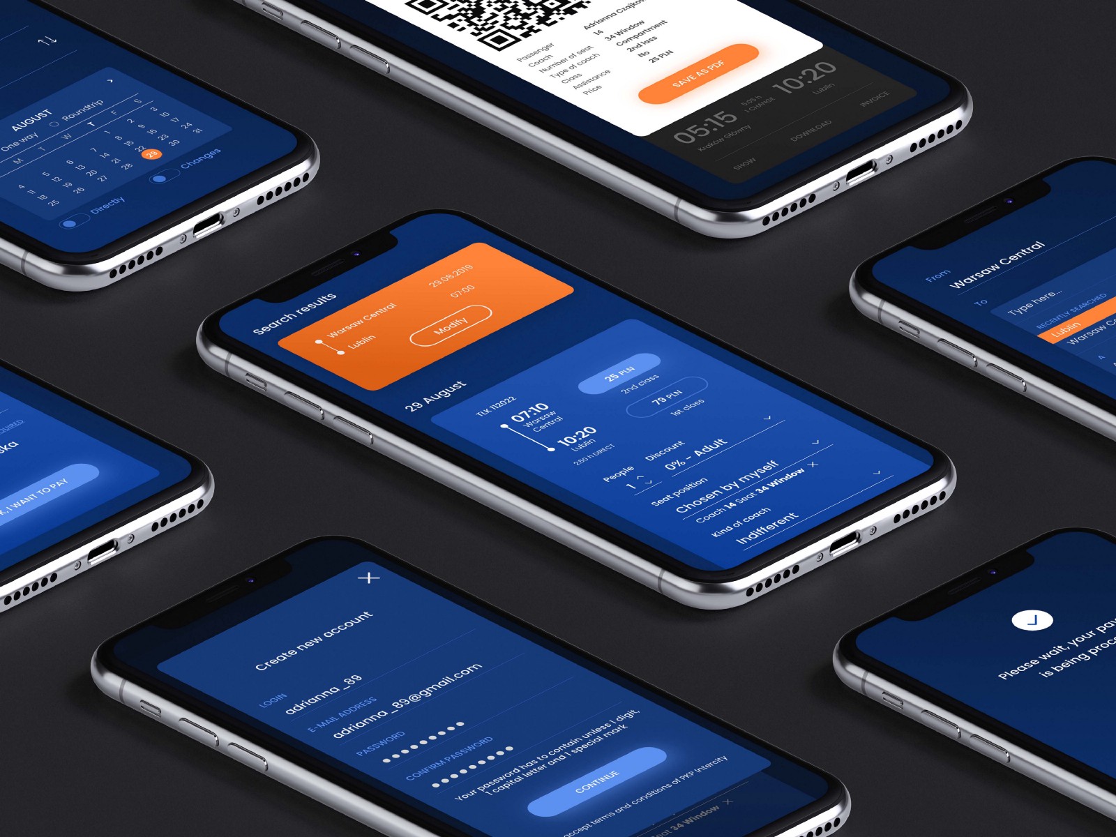
Contrast version:
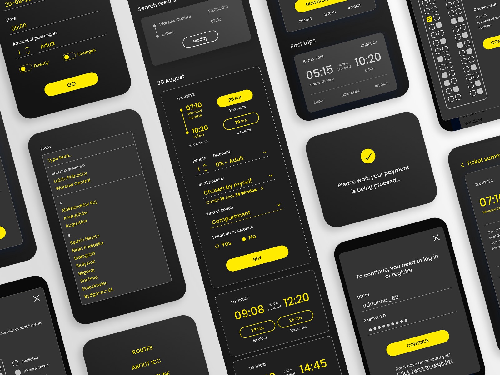
Styleguide:

The comparison between my design and current Intercity website:
I also did a short video presenting the functionality:
The overall amount of screens goes up to 109:

Conclusion:
This project was very challenging and gave me a better understanding of the full UX process and how difficult is to introduce a lot of minor changes into an existing product. In a perfect world we imagine that we can create every project according to our own aesthetics. But when it comes to reality, we seldom have that comfort - we need to be flexible, because it is not just about us anymore.
There is always something you can improve during your research, especially if you do it for the first time. If I had a chance to do that kind of task again, I would make more interviews and select more complex focus groups. As my budget was very scarce, I had to ask "a friend of a friend" and I am aware of the fact that my research was limited and could not respond to all user needs.
However, I am proud that I successfully conducted interviews and tests by myself. According to the rule "you are not a user", I treated it as a great lesson of humbleness as a UX designer.
So even if my research results - compared to a wider group of participants - could turn out to be wrong in some way, it was a great fun to conduct a whole process from scratch.
More screens are available on my Dribbble and Behance.
Do you like our work or have some questions regarding this case study?
Contact Us!
design@visuality.pl